San Francisco Chamber of Commerce | Identity Redesign
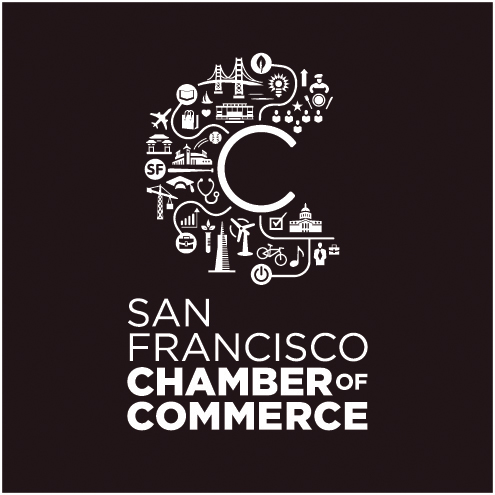
Designers: Ryan D. Herras, Primo Angeli | Illustration: Ryan D.Herras | Creative Directors: Primo Angeli, A. Stapley | Agencies: Primo Angeli Design International + ShredSF | Client: San Francisco Chamber of Commerce -- CONCEPT: “C is for City, Chamber and Community”. - Celebrating the individuality which represents the whole—“your business. our city.” Captured within the illustrative C letterform, we see a tapestry of people, businesses, and landmarks— emphasizing the productive personality of the city and the rich visual landscape in which it thrives. - Captured within the illustrative C, there is also a Smaller C, leading to businesses and landmarks also connecting individual people to a larger discourse of networking opportunities, culture and experiences. CC is an advocate for business. - Icons: People, Businesses and Landmarks Although one icon may stand on its own merits, the beauty of the C is that it is composed of all the city’s icons. The business is invited to play a vital role in both the commerce and personality of the city— essentially becoming apart of the community and city. Color Palette: We used an electric color palette to represent both the vibrant and vital personality of this chamber and city. See yourself in the C. Business must ask itself: “Where does my business fit in?” AND “How do we get there?” A: through the Chamber of Commerce. Other Strengths: The C will become an recognizable icon of chamber, commerce and city. Replaces current Chamber’s brand and reintroduces a brand of edge, vibrancy and vitality.