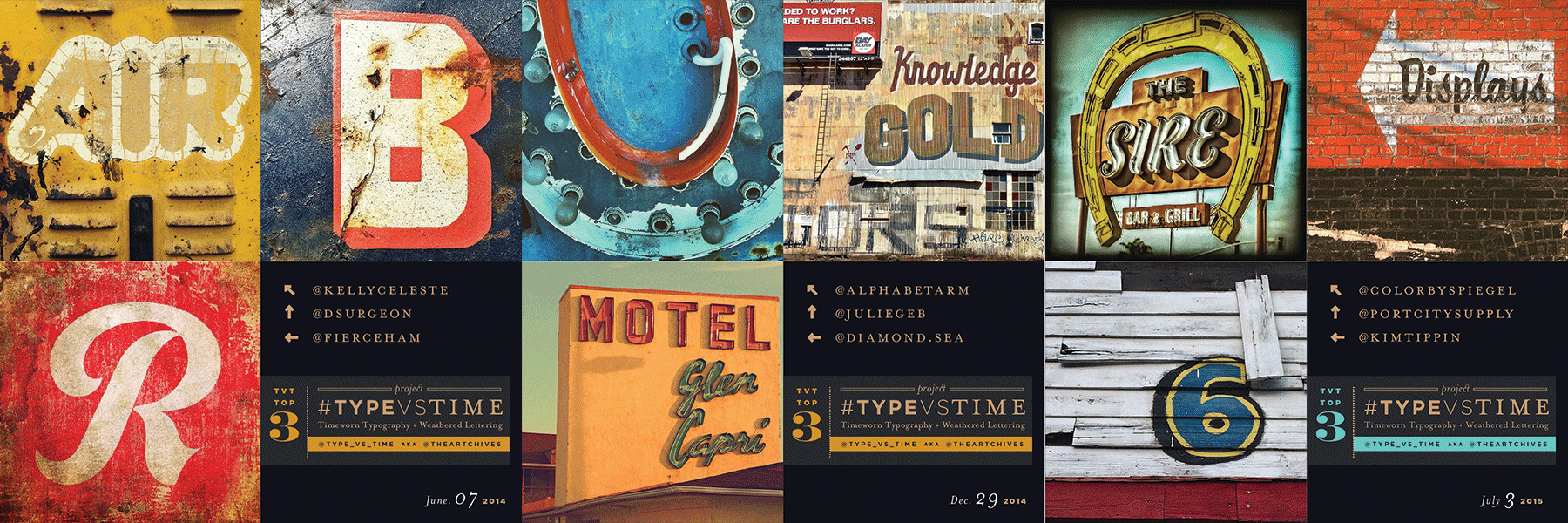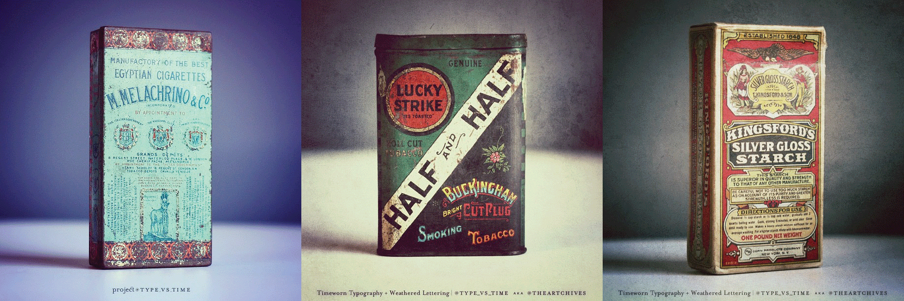
Type vs. Time | @Type_vs_Time | #TypevsTime
#TypevsTime | Type vs. Time | @Type_vs_Time - Instagram based project that showcases Time-worn Typography & Lettering on distressed, weathered & imperfect surfaces.
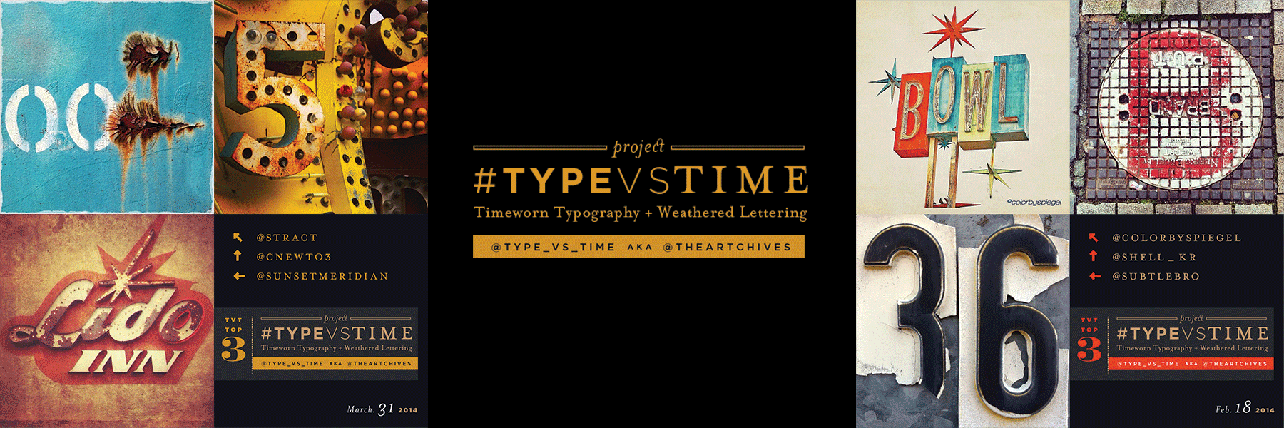
Type vs. Time is an Instagram based #hashtag project that showcases
Time-worn Typography & Lettering on distressed, weathered & imperfect surfaces.
-
Project @Type_vs_Time + #TypevsTime on Instagram
Project @Type_vs_Time + #TypevsTime on Instagram
The Type vs. Time concept began many years ago, when I discovered the incredible Japanese aesthetic philosophy, Wabi-Sabi. In Leonard Koren’s book, Wabi-Sabi: For Artists, Designers, Poets & Philosophers, he states Wabi-Sabi finds “beauty in all the marks that time, weather and use leave behind." This statement resonated with me. In my opinion, Wabi-Sabi was the perfect counter-balance to the fundamentals that all graphic designers embrace: the doctrine of swiss precision, Bauhaus clean geometric forms and balanced visual composition. I was drawn to the idea that regardless of how perfect and masterfully something was crafted, time always imposes its marks. Any well-trained designer will painstaking obsess over kerning and leading Type. He works then reworks his designs until it so communicates clearly. But the designer cannot protect from the force of Time. Time waits patiently and eventually smothers your once pristine design with its beautiful imperfections. This phenomenon celebrates the imperfections of life, and I began finding beauty in the most curious spots: weathered signage, dilapidated buildings and worn sidewalks. I began seeing objects, not in their current state of existence, but appreciate them for their position within the process of time. { @Type_vs_Time + #TypevsTime on Instagram }
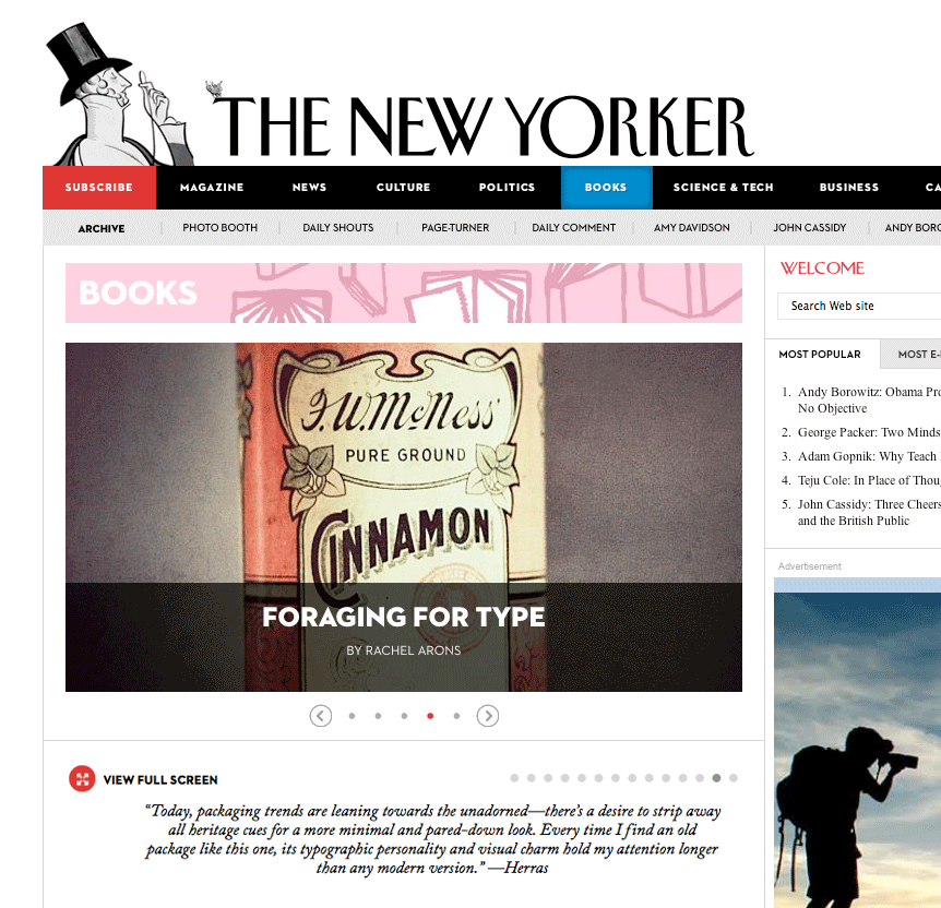
Read about Type vs. Time and other type and design
related projects in the New Yorker article:
AUGUST 26, 2013
FORAGING FOR TYPE
BY RACHEL ARONS
www.newyorker.com/books/page-turner/foraging-for-type